Dibujar el icono de un calendario con CSS
Hoy vamos a aprender a crear el icono de un calendario sólo con CSS. Para ello, vamos a hacer lo siguiente:
HTML
El código HTML que vamos a usar es muy simple:
<p class="calendar">7 <em>February</em></p>
Primero va el día en valor numérico y luego el mes correspondiente.
CSS
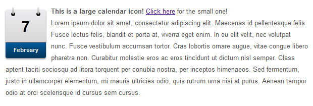
En la siguiente imagen podemos ver las partes del CSS del icono.

Lo primero es el contenedor:
.calendar{
	margin:.25em 10px 10px 0;
	padding-top:5px;
	float:left;
	width:80px;
	background:#ededef;
	background: -webkit-gradient(linear, left top, left bottom, from(#ededef), to(#ccc));
	background: -moz-linear-gradient(top,  #ededef,  #ccc);
	font:bold 30px/60px Arial Black, Arial, Helvetica, sans-serif;
	text-align:center;
	color:#000;
	text-shadow:#fff 0 1px 0;
	-moz-border-radius:3px;
	-webkit-border-radius:3px;
	border-radius:3px;
	position:relative;
	-moz-box-shadow:0 2px 2px #888;
	-webkit-box-shadow:0 2px 2px #888;
	box-shadow:0 2px 2px #888;
}
El elemento «em» contiene el nombre del mes:
.calendar em{
	display:block;
	font:normal bold 11px/30px Arial, Helvetica, sans-serif;
	color:#fff;
	text-shadow:#00365a 0 -1px 0;
	background:#04599a;
	background:-webkit-gradient(linear, left top, left bottom, from(#04599a), to(#00365a));
	background:-moz-linear-gradient(top,  #04599a,  #00365a);
	-moz-border-radius-bottomright:3px;
	-webkit-border-bottom-right-radius:3px;
	border-bottom-right-radius:3px;
	-moz-border-radius-bottomleft:3px;
	-webkit-border-bottom-left-radius:3px;
	border-bottom-left-radius:3px;
	border-top:1px solid #00365a;
}
Los siguientes elementos sirven para crear los agujeros de las anillas del calendario:
.calendar:before, .calendar:after{
	content:'';
	float:left;
	position:absolute;
	top:5px;
	width:8px;
	height:8px;
	background:#111;
	z-index:1;
	-moz-border-radius:10px;
	-webkit-border-radius:10px;
	border-radius:10px;
	-moz-box-shadow:0 1px 1px #fff;
	-webkit-box-shadow:0 1px 1px #fff;
	box-shadow:0 1px 1px #fff;
}
.calendar:before{left:11px;}
.calendar:after{right:11px;}
Y por último creamos las anillas del calendario:
.calendar em:before, .calendar em:after{
	content:'';
	float:left;
	position:absolute;
	top:-5px;
	width:4px;
	height:14px;
	background:#dadada;
	background:-webkit-gradient(linear, left top, left bottom, from(#f1f1f1), to(#aaa));
	background:-moz-linear-gradient(top,  #f1f1f1,  #aaa);
	z-index:2;
	-moz-border-radius:2px;
	-webkit-border-radius:2px;
	border-radius:2px;
	}
.calendar em:before{left:13px;}
.calendar em:after{right:13px;}
Ahora ya tendremos nuestro propio icono. Podéis ver un ejemplo en el siguiente enlace:
 VER EJEMPLO